November 3, 2026
What Is a Serif Font? Meaning, Types and Examples
You have probably read thousands of pages in a serif font without ever naming it. Open a novel, a newspaper or an old school essay and you are looking at one. So, what is a serif font, and why does it still matter in a world full of clean, modern screens?
This guide covers the definition, where serifs came from, the main types, and how to choose the right one for your project.
What Is a Serif Font?
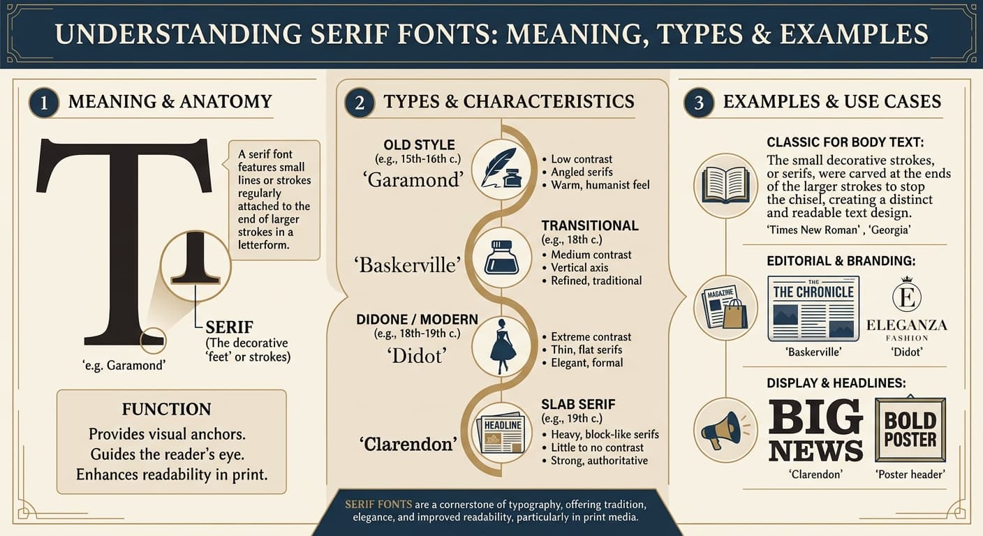
A serif font is a typeface where the letters have small strokes, or “feet,” attached to the ends of their main lines. Look closely at the capital “T” in Times New Roman. The little horizontal flicks at the tips of the top bar and at the base of the stem are the serifs.
A typeface without those finishing strokes is called sans serif. The word “sans” is French for “without,” so the name simply means “without serifs.”
That is the whole idea. The rest of this article explains why those tiny strokes make such a difference.
Where Did Serif Fonts Come From?
Serifs are older than printing. Most historians trace them back to the carved capital letters of ancient Rome. Stone carvers first painted a letter outline, then chiseled along it. The chisel tended to leave small flared ends at the tips of strokes, and the look stuck.
When the printing press arrived in the 15th century, early typefaces copied the handwriting and carved lettering people already knew. Serifs came along for the ride. For several centuries, almost all printed text was serif, and sans serif only became common in the 19th century.
How to Recognize a Serif Font
You can spot a serif font in a few seconds if you know what to look for:
- Small strokes at the stroke ends. These are the serifs themselves.
- Varied stroke thickness. Many serif fonts mix thick and thin lines, which gives them a calligraphic rhythm.
- A grounded baseline. The serifs form a subtle horizontal line that guides the eye along a row of text.
- A traditional feel. Serif text usually reads as formal, established and trustworthy.
The Main Types of Serif Fonts
Not every serif font looks alike. Typographers usually sort them into four groups.
1. Old-style serifs. These are the earliest designs, shaped by handwriting. The contrast between thick and thin strokes is gentle, and the serifs are curved and bracketed. Garamond is the classic example.
2. Transitional serifs. These sit between old-style and modern. They have sharper contrast and crisper serifs. Times New Roman and Baskerville both belong here.
3. Didone (modern) serifs. These are dramatic and high-fashion, with extreme contrast between hairline and thick strokes and thin, flat serifs. Bodoni is the best known. They look elegant in large sizes but can feel fragile in small text.
4. Slab serifs. These have thick, blocky serifs and a sturdy, confident look. Rockwell is a common example, and typewriter-style fonts belong in this family too.
Serif Fonts at a Glance: Complete Guide Table
TypeKey FeaturesPopular ExamplesBest Used For
Old-style
Soft contrast, curved bracketed serifs, handwritten feel
Garamond, Palatino, Caslon
Books, long reading, elegant branding
Transitional
Sharper contrast, refined serifs, balanced and neutral
Times New Roman, Baskerville, Georgia
Newspapers, academic papers, business documents, websites
Didone (modern)
Extreme thick-thin contrast, hairline flat serifs
Bodoni, Didot
Fashion magazines, headlines, luxury brands
Slab serif
Thick, blocky serifs, strong and sturdy shapes
Rockwell, Clarendon, Courier
Posters, headings, logos, typewriter-style design
Overall use
Formal, readable, traditional
n/a
Print, editorial and professional writing
Famous Serif Font Examples
Here are the serif fonts you are most likely to meet:
- Times New Roman: Created in 1931 for The Times of London, it became a default in word processors and a standard for academic work.
- Georgia: Designed to stay clear on low-resolution screens, which makes it a favorite for websites and digital articles.
- Garamond: Light, refined and centuries old, with many modern versions available.
- Baskerville: A polished, sharp-edged serif used in books, magazines and corporate branding.
- Playfair Display: A modern, free-to-use font with high contrast that suits headlines.
Serif vs. Sans Serif: What’s the Difference?
The difference is simple. Serif fonts have finishing strokes and sans serif fonts do not. But the practical effects go further.
Serif fonts tend to feel traditional, classic and authoritative. Sans serif fonts tend to feel clean, modern and minimal. That is why law firms, publishers and universities often choose serifs, while tech startups lean toward sans serif.
Neither style is better in every situation. A well-designed font of either kind can be easy to read. What matters is the size, spacing and context.
Are Serif Fonts Easier to Read?
This is the most common follow-up question, and the honest answer is “it depends.”
In print, serif fonts have a good reputation for long reading. Many designers believe the serifs help the eye move smoothly from letter to letter, and they help tell similar characters apart. That is one reason novels and newspapers rely on them.
On screens, the picture is less clear. Modern high-resolution displays render fine details well, so serif text now looks sharp on most devices. Older, low-resolution screens used to blur thin serifs, which is why web designers once preferred sans serif. Today, either works if you choose a font built for screens, like Georgia, and set a comfortable size.
The practical takeaway is to test your text. Read it on the device your audience will use.
When Should You Use a Serif Font?
Use a serif font when you want your design to feel:
- Professional and trustworthy, as in reports, contracts and resumes.
- Literary or editorial, as in books, essays and blog articles.
- Elegant or premium, as in invitations, boutique branding and fashion.
- Established, as in heritage brands and institutions.
Avoid very thin, high-contrast serifs for tiny text, since the hairlines can disappear.
Tips for Pairing Serif Fonts
Good design rarely uses just one font. Here are a few easy rules:
- Pair a serif with a sans serif. A serif headline with a sans serif body, or the reverse, gives clear contrast.
- Limit yourself to two fonts. Three or more usually looks messy.
- Keep the mood consistent. A formal serif pairs well with a calm, neutral sans serif, not a playful one.
- Use size and weight for hierarchy. Bigger and bolder means more important.
If you want to explore this further, this guide to font styles on the FontBlast blog covers the other major categories and how they work together.
Frequently Asked Questions
What is a serif font in simple words?
It is a font where the letters have small decorative strokes at the ends of their lines, like the feet on a capital “T” or “H.”
Is Arial a serif font?
No. Arial is a sans serif font, because its letters have no finishing strokes.
Is Times New Roman a serif font?
Yes. It is one of the best-known examples, and it belongs to the transitional group.
Are serif fonts good for websites?
Yes, when they are chosen with care. Fonts like Georgia are designed for screens, and serif body text with a sans serif heading is a popular combination.
Is Courier a serif font?
Yes. It is a slab serif with fixed-width letters, which gives it the look of a typewriter.
Final Thoughts
So, what is a serif font? It is a typeface with small finishing strokes on its letters, a design that began with Roman stone carvers and has been refined over centuries of printing. The four main types are old-style, transitional, Didone and slab serif, and each suits a different purpose.
Pick the font that matches your message, check that it reads well in your format, and pair it with a simple sans serif when you need contrast. For more background on the history and technical details, the Wikipedia article on serifs is a useful reference.