November 16, 2026
Letter Design: A Practical Guide to Creating Stylish, Readable Letters
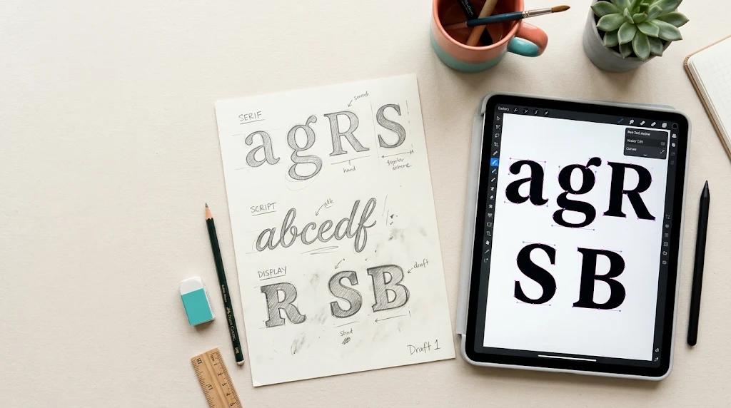
Letter design is the craft of shaping individual letters, whether drawn by hand, built as a custom typeface, or styled digitally, so they look distinctive while staying easy to read. It covers everything from logo lettering and monograms to fancy text and decorative alphabets. Good letter design balances three things: legibility, personality, and consistency.
Types of Letter Design
- Typography: Choosing and arranging existing fonts for a purpose.
- Lettering: Drawing each letter by hand, custom for one use such as a poster or logo.
- Calligraphy: Flowing, pen-based writing with controlled strokes.
- Monograms and initials: One or two letters combined into a brand mark or personal emblem.
- Decorative and 3D letters: Ornate, outlined, shadowed, or illustrated letters, often used for invitations, social posts, and packaging.
- Digital fancy text: Unicode-style letters generated by online converters for bios, captions, and gaming names.
Core Principles of Good Letter Design
Legibility first. A letter that looks beautiful but can’t be recognised has failed. Keep the basic skeleton of each letter familiar.
Consistent stroke and shape. Stroke thickness, curves, and angles should repeat across the alphabet so the letters feel like a family.
Spacing and kerning. Uneven gaps are the fastest way to make a design look amateur. Adjust the space between pairs like “AV” or “To” by eye, not just by default settings.
Contrast and hierarchy. Use size, weight, and colour to show what matters most. A bold initial paired with lighter text guides the reader naturally.
Colour and background. Check contrast between the letters and their background. Low contrast hurts readability, especially on mobile screens.
How to Design a Letter, Step by Step
- Define the purpose. A wedding invitation, a logo, and a gaming profile need very different styles.
- Collect inspiration. Look at mood boards, alphabet collections, and logo examples to find a direction.
- Sketch on paper. Draw rough versions of each letter before touching any software. Try several shapes for the same letter.
- Refine the best sketch. Fix proportions, curves, and stroke weight. Keep one clear idea, such as rounded, sharp, or handwritten.
- Digitise it. Trace your sketch as vector shapes in a tool like Illustrator, Inkscape, or Figma so it scales without losing quality.
- Test it. View it at small and large sizes, in black and white, and on different backgrounds.
If you’d rather start from existing fonts, Google Fonts offers a huge free library that you can filter by style, such as script, display, or handwriting, and test with your own text before committing.
Tools Worth Knowing
For vector work, Adobe Illustrator, Inkscape (free), and Figma are the usual choices. Procreate suits hand lettering on a tablet. For quick, no-design-skills results, online generators convert plain text into stylised characters. If you want colour effects on your text for games or chat platforms, a colored text converter can help.
Remember that many “fancy letters” produced this way are Unicode symbols, so they may not display correctly everywhere and can be read poorly by screen readers. Use them sparingly for decoration, not for important information.
Common Mistakes to Avoid
- Using too many styles in one design.
- Over-decorating until letters become unreadable.
- Ignoring kerning and line spacing.
- Choosing trendy fonts that don’t match the message.
- Skipping contrast and accessibility checks.
- Copying a font or logo directly, which can cause licensing problems. Always check a font’s licence before commercial use.
Where Letter Design Is Used
Brand logos, packaging, wedding and event stationery, posters, social media graphics, book covers, signage, tattoos, and in-game or app text all rely on strong letter design. Each context has its own needs: signage needs distance readability, while a social post can afford more personality.
Summary
Letter design means shaping letters so they are both attractive and readable. Start with a clear purpose, sketch by hand, keep strokes and spacing consistent, and test your design at different sizes and colours. Use ready-made fonts when speed matters, and custom lettering when you want something unique. Above all, never trade legibility for decoration.