November 18, 2026
Cubition Font: A Clean Geometric Sans for Modern Design
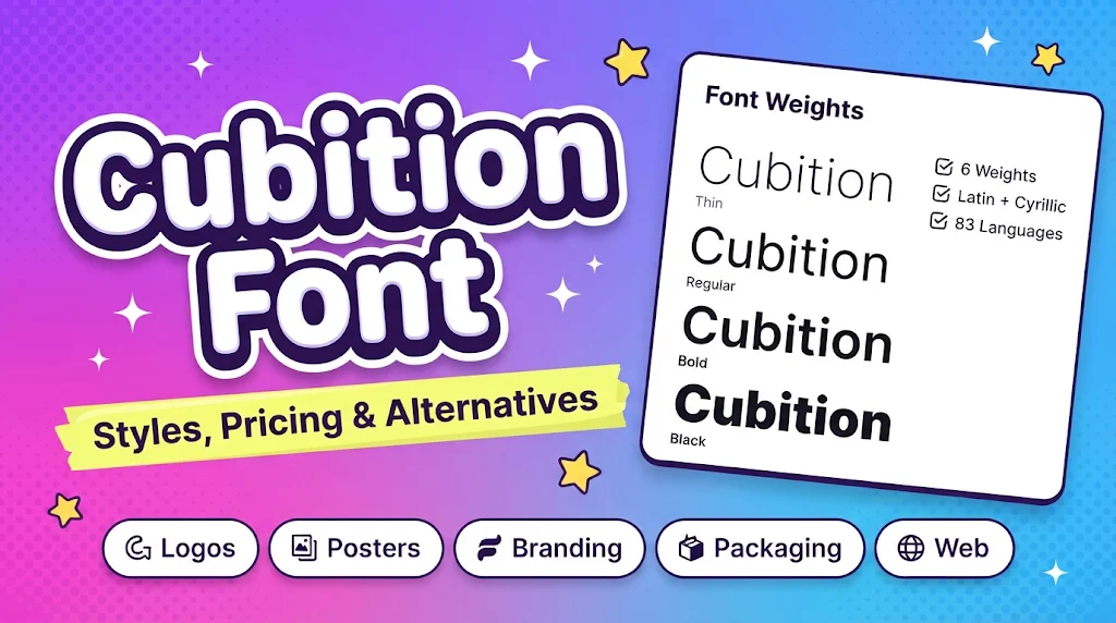
Cubition is a geometric sans-serif typeface that has gained steady attention among designers looking for a sharp, minimal look without losing readability. It was designed by Mykola Savchuk of NicolassFonts, released in 2021, and is built on the structure of the Everest Pro sans-serif. If you have been searching for a font that feels modern, structured and slightly technical, Cubition is worth a closer look.
What Makes Cubition Different
Cubition font belongs to the modular geometric sans category. Its letters are constructed from simple, consistent shapes, which gives text a calm, orderly rhythm. The design follows the principles of modernism and functionalism, so nothing is decorative for its own sake. The result is a typeface that feels crisp, clean and confident.
According to the Rentafont listing for Cubition, the family is positioned mainly for headings, initial caps and logos. It is also tagged for magazines, posters, landing pages, packaging, labels and advertising. That tells you where it performs best: in display settings where a short line of text needs impact, rather than in long blocks of body copy.
Weights and Language Support
The family comes in six styles: Thin, Light, Regular, Medium, Bold and Black. This range is one of its strongest practical advantages. Thin and Light suit elegant, airy layouts such as fashion or cosmetics branding. Regular and Medium work well for interface elements and subheadings. Bold and Black are built for strong headlines, posters and logo wordmarks.
Cubition also supports a wide range of languages, around 83 according to the foundry listing, covering both Latin and Cyrillic scripts. That makes it useful for multilingual brands, particularly those working across English, Ukrainian, German, Polish, Spanish and French audiences.
Popular Cubition Styles People Search For
Looking at what people actually look for, a few individual styles come up repeatedly. Cubition Bold is the most common choice for headlines and brand marks because of its strong presence. Cubition Medium is popular for subheadings and packaging text, where designers need weight without heaviness. Cubition Regular is the default pick for balanced layouts, while Cubition Light and Thin attract those building minimalist or premium-feeling designs. Cubition Black is reserved for the boldest statements, such as posters and campaign titles.
For most projects, a pairing of Bold for headings and Regular or Light for supporting text creates clear hierarchy while staying inside a single family.
Where Cubition Works Best
The font’s personality is minimal, urban and slightly industrial, so it fits naturally with technology, architecture, fashion, retail and navigation-style design. It also appears in associations with cosmetics, fitness and engineering. Because it is available for both desktop and web use, it can move easily between print layouts and websites.
One practical tip: when setting Cubition in the lighter weights, increase letter spacing slightly and check contrast carefully on screens. Thin strokes can lose clarity at small sizes, especially on mobile. Good spacing and contrast are basic principles of letter design, and FontBlast’s guide to letter design covers these fundamentals well if you want a refresher before building a typographic system around a font like this.
Licensing and Cost
Cubition is a commercial font, not a free one. On Rentafont, individual styles were listed at about $17 each and the full six-style family at $49 at the time of writing, with rental and subscription options also available. Prices differ across marketplaces such as MyFonts and Fontspring, so compare before buying. Always confirm the license type, since desktop, web and app use are typically licensed separately.
Fonts Similar to Cubition
If Cubition does not quite fit your budget or brief, several alternatives share its geometric character. Nexa, Cyntho Next, Electronica and Daikon are listed as similar families, and the same foundry offers Unytour Pro and Unytour Display Pro. If you need a free option, browsing the geometric sans category on Google Fonts is a sensible starting point.
Conclusion
Cubition is a well-built, versatile geometric sans-serif with six weights, broad language coverage and a clean, modern personality. It excels in headings, logos, posters and branding, where its crisp forms and strong weights can shine. It is less suited to long reading text, so use it where impact matters most. Check the license for your intended use, test the lighter weights on screen, and pair it with a simple companion font if needed. Used with care, Cubition can give a project a polished, contemporary identity.