September 29, 2026
Wonky Serif: The "Imperfect" Aesthetic Reshaping Type Design
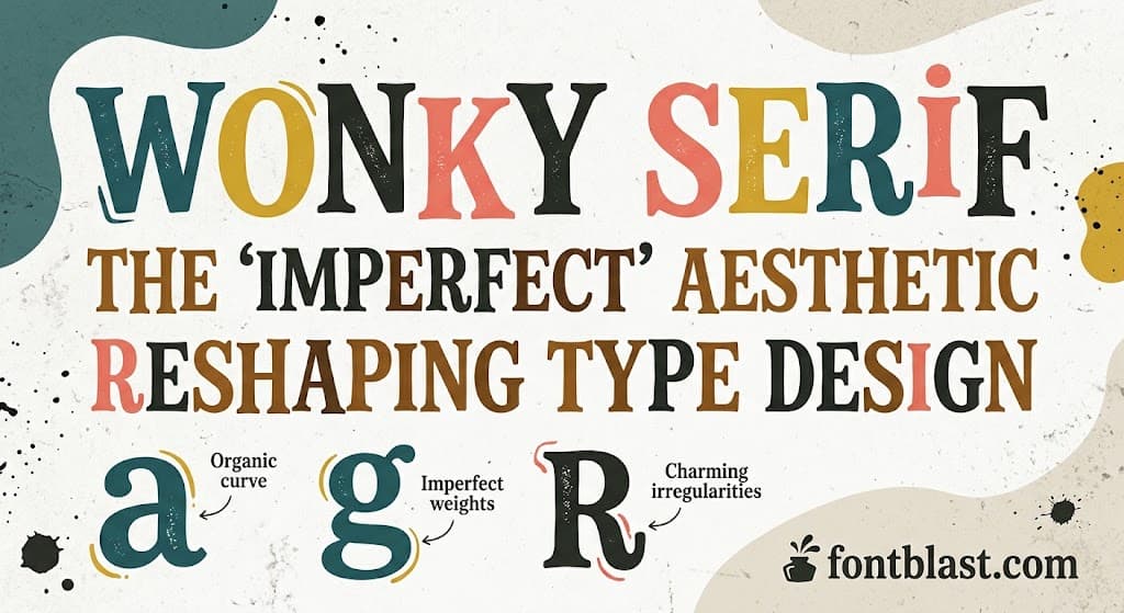
Wonky serif is emerging as one of the most recognizable type trends of 2026. The term doesn't describe a single typeface—it describes a category of serif fonts that deliberately preserve irregularity, slant, uneven stroke weights, and other "flaws." In an era saturated with algorithmically generated, flawless visuals, these tilted serifs have become a scarce signal: they communicate human judgment, handcraft, and brand confidence.
What Is a Wonky Serif?
A wonky serif is a typeface style that deliberately injects irregularity into a traditional serif skeleton. Its characteristics include letters that lean slightly, stroke weights that shift where they shouldn't, baselines with subtle wobble, and inconsistent serif shapes. In traditional type design, these would be defects. In wonky serifs, they become the design language itself.
The most frequently cited example is Fraunces. Designed by Undercase Type and available free on Google Fonts, it is an open-source variable font. Its most distinctive feature is a variable axis called "WONK," which lets designers control exactly how tilted the font appears—from relatively regular to distinctly irregular. Fraunces also has a "SOFT" axis controlling stroke softness and an optical size axis that optimizes rendering at different scales.
The cleverness of this approach is that it doesn't treat wonk as a fixed style. It makes wonk an adjustable variable. You decide how much "imperfection" a project needs.
Why Brands Are Choosing "Imperfect"
The rise of wonky serifs follows a clear logic: clean has become suspicious.
By around 2020, the internet's visual language had converged on a few reliable signals: geometric sans-serifs, tight grids, flat illustration, everything optimized to pixel perfection at every breakpoint. The problem is that this "perfection" became ubiquitous—and therefore indistinguishable. When a brand uses the same clean font as everyone else, it signals nothing.
Wonky serifs offer a counter-signal. Research suggests that actively exposing flaws is an expensive confidence signal—you wouldn't allow yourself to look slightly "unfinished" if you didn't believe your product could withstand that honesty. Consumers read imperfection as courage, not carelessness.
The data supports this. Canva's 2026 design trend report documented a 527% surge in lo-fi aesthetic searches and a 90% increase in DIY-inspired design choices. Monotype's trend report even coined a category term—"PROFESHINAL," a deliberate misspelling of "professional"—to describe design that is "perfectly imperfect, proudly and unapologetically real."
How to Use Wonky Serifs in Real Projects
The right application depends on how strong a signal you want to send.
Brand identity and logos. Wonky serifs suit brands that want to convey "classic with attitude." As Typogram's analysis notes, they communicate "classic vibes with a friendly and reassuring tilt." This makes them excellent for heritage or traditional brands that want to acquire a warm, slightly quirky personality. DuckDuckGo's typeface refresh is a case in point: they added subtle "quirks" to the G, M, and numerals, conveying human judgment without compromising readability.
Editorial design and publishing. Fraunces's optical size axis lets it perform well at both small body-text sizes and large headline sizes. The 9pt version optimizes small-size readability, while 72pt and 144pt versions suit landing page headlines and hero graphics.
Food, beverage, and retail brands. Envato's trend report notes that curvy serif fonts are rising among "independent brands in food, beverage, and retail," especially where minimalism isn't meeting their needs. These fonts pair well with exaggerated imagery or soft gradient backgrounds to boost playfulness on websites and apps.
When to avoid it. Wonky serifs carry a strong personality signal. In contexts demanding absolute neutrality—corporate earnings reports, legal documents, medical interfaces—using one sends the wrong message. It also doesn't work as a body-text font for long passages; the irregularity becomes distracting in dense reading.
Variable Fonts Make Wonk Controllable
Wonky serifs became practical in 2026 largely because variable font technology matured.
Fraunces, for example, is a single variable font file containing multiple axes. You can precisely adjust the "WONK" axis value through CSS or a design tool's variable control panel. This means one font file can generate infinite intermediate states, from nearly regular to distinctly tilted.
This flexibility solves a core contradiction of wonky serifs: brands need personality, but different contexts need different degrees of it. A logo can use a high WONK value to maximize recognition. A section headline can use a medium value to stay professional. Small body text can use a low value to ensure readability. One font file, one set of variable parameters, covering an entire visual system.
Other Wonky Serifs Worth Watching
Beyond Fraunces, several typefaces express different facets of this style.
Gigi May is described as a "delightfully wonky serif bubble font," injecting playfulness into the serif form. It suits children's art, headlines, logos, and independent brands.
Simply Sweet Serif is a hand-drawn all-caps wonky serif with double-letter ligatures to add naturalness. It works for greetings, branding, invitations, and craft projects.
So Wonky is a hand-drawn serif by Bia Andrade. Because the characters are hand-drawn, "some wonky lines" occur naturally, adding an organic texture.
TT Alientz takes a different path: a typeface with a "spiky and wonky" style featuring "pointed expandable serifs and wavy details." This shows the wonky concept can extend into more geometric and futuristic territory.
The Bottom Line
The rise of wonky serifs is not a passing aesthetic preference—it is a rebellion against over-smoothing. As AI-generated visuals become more common, fonts with visible human traces—slightly tilted letters, irregular strokes, imperfect curves—become more valuable. They communicate judgment, confidence, and authenticity.
For designers and brands, the key question isn't "should I use a wonky serif" but "how far should I take it." Variable font technology has turned that decision from binary into a continuous adjustment. You can start with Fraunces's WONK axis and find the precise imperfection value that belongs to your brand.