September 29, 2026
Halloween Fonts: The Ultimate Guide to Spooky, Scary, and Sweet Typography
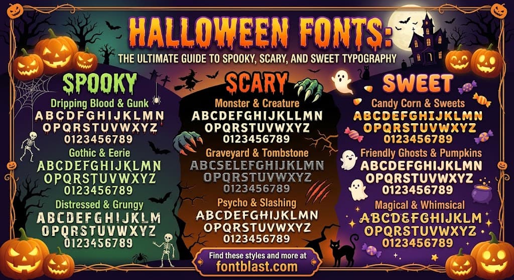
Halloween fonts do more than spell words—they set the mood before a single sentence is read. Whether you're designing a haunted house flyer, a trick-or-treat invitation, or seasonal merchandise, the right typeface can transform ordinary text into something that feels genuinely eerie or delightfully festive. This guide explores the world of Halloween typography, from iconic film fonts to the practical considerations of choosing and pairing spooky letterforms.
The Iconic Halloween Font: A Film Legacy
Few typefaces are as instantly recognizable as the one used for John Carpenter's 1978 slasher classic, Halloween. The film's poster—with its menacing pumpkin, a knife-wielding hand, and stark black background—featured a title rendered in ITC Serif Gothic Heavy, a hybrid typeface created by American designer Herb Lubalin and Italian Tony DeSpigna in 1972 -18-20.
The font's genius lies in its balance: it's heavy and gothic, yet modern. The white letters with orange outlines became so associated with the genre that the same typeface appeared in countless other horror films throughout the 1980s -6. Interestingly, the standard version of ITC Serif Gothic has also been used in decidedly non-horror contexts, including recent Star Wars films like The Last Jedi and The Force Awakens -18.
This crossover appeal reveals something important about Halloween typography: the most effective spooky fonts are versatile enough to work beyond the holiday, carrying an air of drama and mystery that adapts to different contexts.
The Spectrum of Halloween Typography
Halloween fonts aren't a single category—they're a diverse ecosystem ranging from genuinely terrifying to charmingly cute. Understanding this spectrum is essential for matching typography to the right project.
Classic Horror and Gothic
At the darker end of the spectrum are fonts designed to evoke genuine dread. These typically feature:
- Sharp, jagged terminals that suggest claws or fangs
- Decayed or distressed textures mimicking age and rot
- Dripping or melting forms that feel unstable and visceral
- Blackletter and gothic influences connecting to centuries of dark European tradition
Fonts like Grims Acid (a liquid-inspired display face for slime, mutation, and zombie themes) and Black Fire (with flame-inspired letterforms suited to infernal horror and demon-themed posters) exemplify this category -7. The Cursed Gothic family takes a particularly comprehensive approach, offering ten distinct style variants including Mummy, Skull, Wood, Drop, Root, Witch, Zombie, Devil, and Web versions of the same underlying gothic structure -13.
Playful and Cute
Not every Halloween project calls for genuine horror. Children's events, family-friendly party invitations, and classroom materials benefit from fonts that signal the season without causing nightmares. Halloween Spooky by Issie Studio combines small ghost illustrations with a lively fall palette, making it ideal for daycare events and elementary-school worksheets -17. Griffy, available free on Google Fonts, offers a "playful-creepy" tone that works well for comic-style horror and themed merchandise -9.
Retro and Groovy
A fascinating trend in recent Halloween typography moves away from gothic spikes entirely. Fonts like Halloween by October.store take a groovy, 1970s-inspired direction with rounded forms and a sweet vintage palette -5. This softer personality suits dance parties, roller-rink events, and retro markets—contexts where the event should feel festive first and spooky second. These fonts pair naturally with checkerboards, wavy borders, and simple ghost illustrations rather than blood drips or cobwebs.
Modern and Glitch
Contemporary horror typography increasingly draws from digital aesthetics rather than historical references. Glitch-style fonts—with letterforms that appear corrupted, fragmented, or digitally degraded—create unease by violating expectations of how text should behave. The best examples maintain baseline legibility, allowing viewers to almost read the text normally before the distortions register -9. Vuldra combines Halloween with graffiti and street-style energy, offering a rebellious alternative to traditional seasonal type -7.
Practical Selection: Matching Fonts to Projects
Choosing a Halloween font requires considering both the mood you want to create and the practical demands of your medium.
For Cutting Machines and Cricut
Crafters using Cricut and Silhouette machines face unique constraints. Delicate horror lettering with thin drips or intricate details can be frustrating to weed (the process of removing excess vinyl). Chunky display alphabets with broad strokes, like Halloween Spooky Font by Farz Studio, hold up well in layered craft compositions -19. Many modern Halloween font packages include a separate black version intended specifically for cutting machines, alongside full-color versions for printed materials -5-17. Always verify software compatibility—color fonts (OpenType-SVG format) work in Photoshop, Illustrator, and Inkscape but often won't function in Cricut Design Space -5.
For Canva and Digital Design
Canva users have access to a substantial library of Halloween fonts, including Hellprint, Shlop, Pirata One, Butcherman, and Creepy Graves -8. Font pairing becomes crucial here: a dramatic display font for the headline paired with a clean sans-serif for practical information. Successful Canva combinations include Pirata One + Cardo, Savage + Roboto Mono, and Roller Coaster Serif + Lexend Deca -8.
For Print and Merchandise
When designing for apparel, posters, or packaging, consider how the font will perform at different scales. October Twilight by Misti's Fonts has proven enduringly popular with over 1.7 million downloads on DaFont, its flowing handwritten forms evoking candlelit autumn dusk -13. Midnight Minutes offers a sinister serif display option with sharp, elongated letterforms that deliver "maximum menace with minimal effort" -13.
Font Pairing Strategies for Halloween Designs
Even the most evocative Halloween font will falter if paired poorly. A few principles guide effective combinations:
Contrast mood, not chaos. Pair a highly decorative display font with something clean and neutral. A dripping horror face for the headline can coexist with a simple sans-serif for dates, addresses, and pricing—the quiet font lets the dramatic one breathe -5.
Match the theme to the message. A Spooky But Make It Cute pairing like Parseltongue + Style Script suits a children's party, while A Little Bit Wicked (Arima + Birthstone Bounce) fits a more sophisticated gathering -4. For haunted house branding, a Welcome to Our Haunted Home combination like Yataghan + Luxurious Script sets the right ominous tone -4.
Consider the "AI Slop" factor. Some fonts that once felt distinctive—like certain elegant serifs and monospaced geometrics—have become so ubiquitous in AI-generated content that they now signal genericness rather than creativity. Choosing a less common typeface can be a strategic advantage.
The Cultural Roots of Spooky Typography
Halloween's typographic traditions didn't emerge from nowhere. The Alphabet diabolique, a French anthropomorphic alphabet from the 1820s–1840s, featured devil-themed letters in silhouette that inherited medieval imagery while retaining a carnivalesque, almost humorous quality -2. This historical precedent reveals that Halloween typography has always balanced genuine unease with playful performance.
Similarly, the Berthold Herold Reklameschrift BQ used for the title of F.W. Murnau's Nosferatu (1922) was originally designed in 1901 as a simple advertising typeface—its name literally translates to "advertising script." Its Art Nouveau and Gothic characteristics took on a far more sinister aura when paired with the film's expressionist imagery -6.
Conclusion: Typography as Atmosphere
The best Halloween font doesn't just decorate text—it creates atmosphere before meaning is even processed. Whether you choose the iconic ITC Serif Gothic Heavy for its cinematic pedigree, a playful ghost-themed alphabet for a family event, or a liquid horror display face for a haunted attraction, the goal remains the same: make the viewer feel the season before they read a single word.
With careful attention to mood, medium, and pairing, Halloween typography can transform any project from ordinary to unforgettable—whether that means genuinely unsettling or delightfully spooky.