September 29, 2026
Funky Curvy Serif: The Breakout Font Style
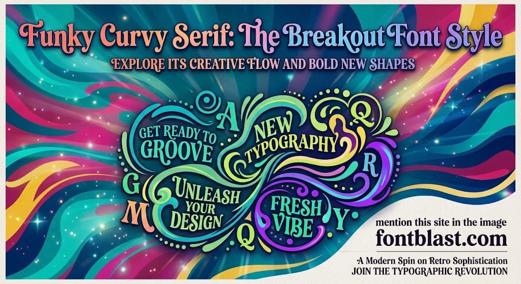
Funky curvy serif is one of the most prominent typeface trends in global design for 2026. With exaggerated curves, plump forms, and a personality rooted in 1970s nostalgia, this style is redefining brand visual language. From tech platform rebrands to food and beverage packaging, this "retro energy with modern confidence" aesthetic is displacing the minimalist look that dominated the past decade.
What Is a Funky Curvy Serif?
A funky curvy serif is a typeface style that combines traditional serif structure with exaggerated, rounded, and deliberately "wonky" curves. Its core characteristics include heavy letterforms, serifs that are plump to the point of being "juicy," flowing and rhythmic stroke transitions, and a subtle irregularity that carries a hand-drawn quality.
This style is not a simple retro revival. What makes it distinctive is how it fuses 1970s psychedelic aesthetics with contemporary clarity and functionality. As font trend reports describe it, the mood is "retro energy, reimagined the modern way."
Design commentators frequently use the phrase "juicy serifs" to capture the visual character. These letters look stretched, curved, and infused with an almost organic vitality—a stark contrast to the cool, restrained, nearly invisible sans-serifs of the earlier minimalist era.
Why This Style Is Dominating 2026
The rise of funky curvy serifs reflects a deeper design shift: brands are moving from "safe" to "expressive."
For the past decade, tech and consumer brands overwhelmingly adopted neutral, clean sans-serifs in pursuit of universality and efficiency. That aesthetic is now being actively abandoned. Envato's 2026 font trend report states plainly that this curvy, juicy serif style "is expected to become one of the major font trends of 2026" and is already appearing in corporate rebrands.
The most cited example comes from Affinity. After its acquisition by Canva, the design software company completed a rebrand led by designer Rob Clarke, choosing a serif with distinctly funky, curvy characteristics. Eventbrite made a similar move, abandoning its minimalist sans-serif logo for a "bouncy" serif.
Another driving factor is a backlash against over-polished AI aesthetics. As AI-generated visuals become increasingly common and increasingly "flawless," typefaces with visible human touch and personality flaws become more valuable. Industry analysis notes that when clients say "the AI version feels cold," what they actually want is "perfectly imperfect" or funky curvy serif type.
Where These Fonts Actually Work
Funky curvy serifs are designed for contexts that demand strong personality. They are naturally suited to the following applications:
Brand identity and logo design. These fonts give a brand immediate warmth, friendliness, and attitude. Compared to neutral typefaces, they communicate "we have personality" rather than "we are professional." This works especially well for lifestyle, food and beverage, and creative service brands.
Posters and headline typography. Heavy strokes and bold curves deliver strong impact at large display sizes. Type designers recommend these fonts for "posters, headlines, packaging, and signage"—contexts where type needs a "bold, retro voice."
Packaging design. Product packaging must capture attention on the shelf instantly. The plump forms and retro character of funky curvy serifs make products look both premium and approachable. Designers describe them as suitable for "boutique labels" and "luxury packaging."
Social media visuals. In a fast-scrolling feed, typefaces with character are more memorable than neutral ones. Envato suggests pairing "juicy serifs with modern color combinations" for websites and app interfaces to "boost playfulness."
Representative Typefaces
Several typefaces released or popularized in 2026 embody this trend. Their common traits: bold curves, plump forms, and a certain "unserious" design attitude.
Routway (LetterFresh) is described as a "bold, funky hand-lettered retro serif with playful curves, heavy letterforms, and an organic vintage feel." It draws explicitly on 1960s–70s expressionist type and suits retro branding, posters, and packaging.
Magnoria (Typetemp Studio) carries "1970s energy" with "bold curved outlines and distinctive ligatures," positioned for "fashion, lifestyle, or food and beverage brands."
Master Riegaza is a "highly expressive display typeface" combining "extremely heavy weights with smooth, seductive curves" to create a "nostalgic yet refined 1970s aesthetic."
Monday Funky (Timelesstype Studio) positions itself as a "bold modern serif with playful retro energy," blending "heavy curves, expressive swashes, and refined contrast."
These typefaces share a consistent design language: they build on traditional serif skeletons while injecting 1970s visual energy and contemporary clarity.
Practical Considerations
Funky curvy serifs are a high-signal typeface choice. Their personality is strong, which means they must be used with restraint.
They work best for display purposes—headlines, logos, covers, packaging. Their heavy forms and complex curves severely compromise readability at small body-text sizes. Designers typically recommend pairing them with a more neutral, restrained typeface to create a "one baseline plus one accent" system.
Another advantage is cross-cultural applicability. Many of these typefaces support hundreds of languages—Master Riegaza supports 255 languages, Magnoria supports 213. This makes them suitable not just for English-language markets but for global brand projects.
From a commercial standpoint, licensing models vary. Some are sold individually through platforms like Fontspring at around $21 per font. Others are available through subscription access on Envato Elements. Some offer free personal use with paid commercial licensing.
The Bottom Line
Funky curvy serifs became a defining type trend of 2026 because they answer a real design need: in a world saturated with algorithmically generated visual perfection, people crave typefaces with warmth, personality, and visible human touch. These fonts do not try to be invisible. They do not pursue neutrality. They announce their presence, sometimes provocatively.
For designers and brands, this style offers a fast way to establish visual identity. But its power demands responsibility. Used with restraint, it becomes a brand's most distinctive visual asset. Used indiscriminately, it loses its force like every trend before it.