October 29, 2026
Free Fonts: Best Styles for Design, Websites & Social Media
The right font can change how people see a design. A simple heading can look modern, elegant, playful, or professional depending on the letters used. This is why free fonts are popular among graphic designers, website owners, students, content creators, and small business owners who want attractive designs without spending money on expensive typography.
You might need a clean font for a business website, a stylish typeface for a YouTube thumbnail, handwritten letters for a wedding invitation, or bold text for an Instagram post. The good news is that there are many free options available for different creative needs.
However, choosing a font involves more than finding an attractive design and clicking Download. You should also consider readability, available font weights, language support, file formats, and licensing terms. A font that works beautifully in a logo may be difficult to read in a long article.
This guide explains where to find free fonts, which styles work best for different projects, how to install them, and what to check before using them for commercial purposes.
What Are Free Fonts?
Free fonts are typefaces that you can access without paying a purchase fee. Depending on the font's license, you may be able to use it for personal projects, websites, documents, social media graphics, or commercial designs.
Not every free font comes with the same permissions. Some are free for personal use only, while others allow commercial projects and may also permit modification or redistribution under specific conditions.
For example, a font creator might allow you to use a typeface for school assignments but require a separate license for paid client work. Another designer might release a font under an open-source license that permits both personal and commercial use.
Before downloading a font, check the license attached to that particular typeface. The word "free" alone does not explain every permitted use.
Best Types of Free Fonts for Different Projects
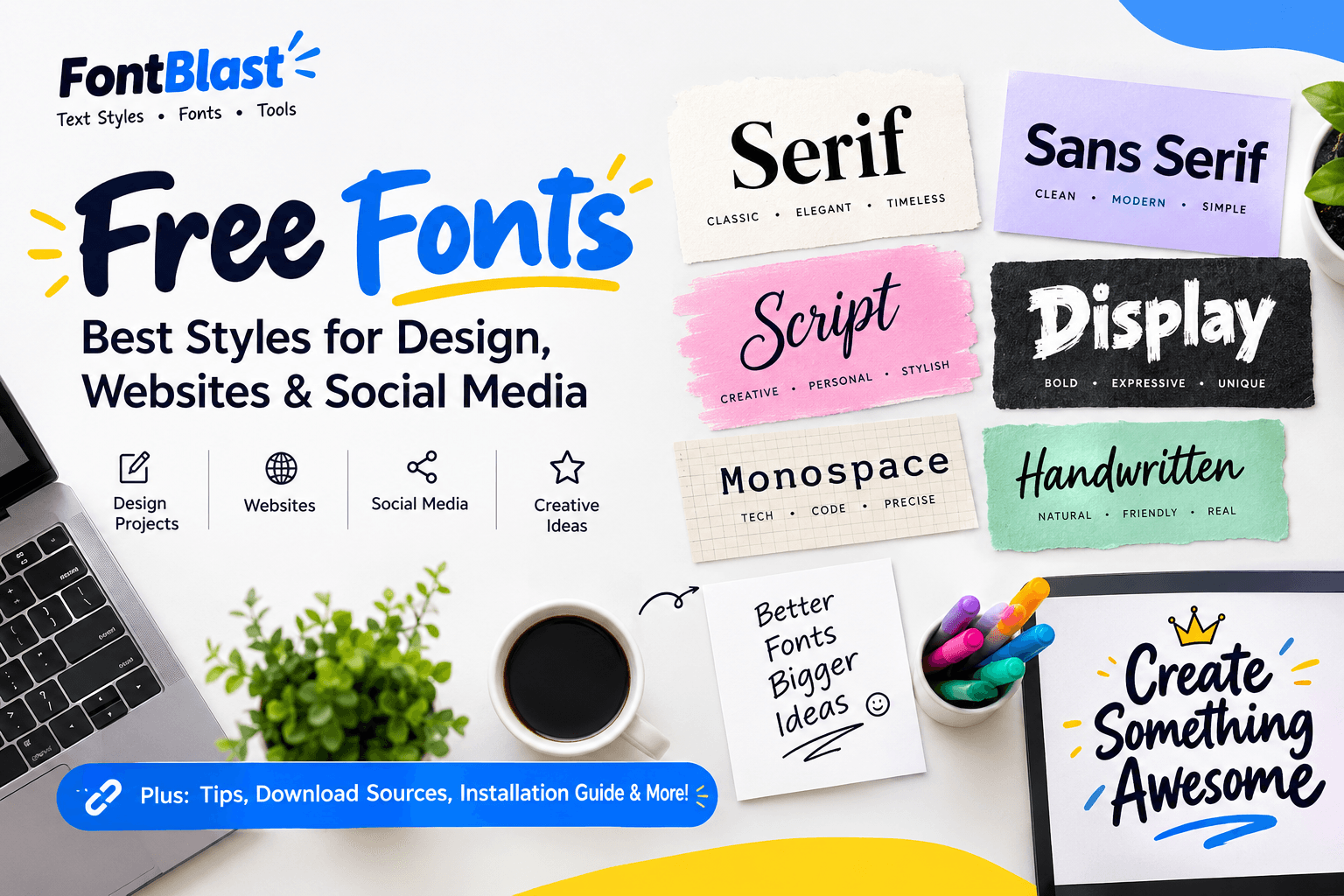
Different font styles create different impressions. Understanding these categories can help you select a typeface that fits your design instead of choosing one simply because it looks attractive.
1. Serif Fonts
Serif fonts have small finishing strokes at the ends of many letters. They often create a traditional, editorial, or sophisticated appearance.
These fonts are suitable for blogs, online magazines, book covers, reports, invitations, and some business websites.
Examples include Lora, Merriweather, and Playfair Display. Each has a different character, so preview the font before using it in a complete design.
2. Sans Serif Fonts
Sans serif fonts do not have the small finishing strokes found in serif typefaces. Their appearance can feel clean, modern, and straightforward.
They work well for website interfaces, business presentations, product descriptions, mobile applications, and general reading.
Popular examples include Poppins, Montserrat, and Open Sans. For websites, choose a font with comfortable spacing and clear letter shapes, particularly for paragraphs.
3. Script and Handwriting Fonts
Script fonts imitate handwritten or calligraphic lettering. Some look casual and friendly, while others resemble formal handwriting.
They are useful for wedding invitations, greeting cards, signature-style logos, creative posters, and short decorative headings.
Dancing Script, Great Vibes, and Pacifico are examples worth exploring. Because decorative lettering can become difficult to read at small sizes, use it carefully.
4. Display and Decorative Fonts
Display fonts are designed to attract attention. They may have unusual shapes, heavy strokes, dramatic curves, or themed designs.
These fonts can work well for gaming graphics, event posters, YouTube thumbnails, product promotions, and short headlines.
Bangers, Bungee, and Creepster are examples of expressive typefaces. They can help a design stand out, but they are usually less suitable for long paragraphs.
5. Monospace Fonts
Monospace fonts give each character the same horizontal width. They are commonly used for code, technical instructions, terminal displays, and certain minimalist designs.
JetBrains Mono and Space Mono are useful examples.
If you create programming tutorials or technical website content, a monospace font can make code easier to distinguish from regular text.
Best Websites to Find Free Fonts
Several websites offer useful font collections. The best choice depends on whether you need website typography, decorative lettering, or downloadable files for graphic design.
WebsiteBest ForWhat to Check
Google Fonts
Websites, apps, documents, and general design
Review the individual font's license and language support
Font Squirrel
Finding fonts for commercial design projects
Read the license provided with the font
DaFont
Decorative, themed, and unusual fonts
Many fonts have different usage restrictions
FontSpace
Exploring creative and display typefaces
Check the license on the individual font page
Fontshare
Modern fonts for branding and professional design
Follow the specific font's usage terms
FontBlast
Exploring styled text, font-related tools, and typography ideas
Check whether the selected feature provides a font file or copyable Unicode text
Google Fonts is a useful starting point for many projects because its library focuses on open-source typefaces. Font Squirrel, DaFont, and FontSpace can help when you want a particular visual style, but their catalogs should not be treated as having identical licensing terms.
FontBlast also serves a different purpose from a traditional font download directory. Its styled-text tools can help users create decorative text for profiles and social posts, while its blog explains how different text styles work.
Free Fonts Comparison: Which Type Should You Choose?
Use this quick guide to match the typeface with the purpose of your project.
<table style="width:100%;border-collapse:collapse;border:1px solid #d1d5db;font-size:15px;line-height:1.5;"> <thead> <tr style="background-color:#f1f5f9;"> <th style="border:1px solid #d1d5db;padding:10px;text-align:left;">Your Project</th> <th style="border:1px solid #d1d5db;padding:10px;text-align:left;">Recommended Style</th> <th style="border:1px solid #d1d5db;padding:10px;text-align:left;">Example Fonts</th> <th style="border:1px solid #d1d5db;padding:10px;text-align:left;">Main Benefit</th> </tr> </thead> <tbody> <tr> <td style="border:1px solid #d1d5db;padding:10px;">Business website</td> <td style="border:1px solid #d1d5db;padding:10px;">Sans serif</td> <td style="border:1px solid #d1d5db;padding:10px;">Poppins, Open Sans</td> <td style="border:1px solid #d1d5db;padding:10px;">Clean and readable appearance</td> </tr> <tr style="background-color:#f8fafc;"> <td style="border:1px solid #d1d5db;padding:10px;">Blog or online magazine</td> <td style="border:1px solid #d1d5db;padding:10px;">Serif or sans serif</td> <td style="border:1px solid #d1d5db;padding:10px;">Lora, Merriweather</td> <td style="border:1px solid #d1d5db;padding:10px;">Comfortable long-form reading</td> </tr> <tr> <td style="border:1px solid #d1d5db;padding:10px;">Wedding invitation</td> <td style="border:1px solid #d1d5db;padding:10px;">Script</td> <td style="border:1px solid #d1d5db;padding:10px;">Great Vibes, Dancing Script</td> <td style="border:1px solid #d1d5db;padding:10px;">Elegant handwritten effect</td> </tr> <tr style="background-color:#f8fafc;"> <td style="border:1px solid #d1d5db;padding:10px;">Gaming thumbnail</td> <td style="border:1px solid #d1d5db;padding:10px;">Display</td> <td style="border:1px solid #d1d5db;padding:10px;">Bangers, Bungee</td> <td style="border:1px solid #d1d5db;padding:10px;">Bold, attention-grabbing headlines</td> </tr> <tr> <td style="border:1px solid #d1d5db;padding:10px;">Programming tutorial</td> <td style="border:1px solid #d1d5db;padding:10px;">Monospace</td> <td style="border:1px solid #d1d5db;padding:10px;">JetBrains Mono, Space Mono</td> <td style="border:1px solid #d1d5db;padding:10px;">Consistent character spacing</td> </tr> <tr style="background-color:#f8fafc;"> <td style="border:1px solid #d1d5db;padding:10px;">Social media bio</td> <td style="border:1px solid #d1d5db;padding:10px;">Decorative Unicode text</td> <td style="border:1px solid #d1d5db;padding:10px;">Cursive, bold, gothic styles</td> <td style="border:1px solid #d1d5db;padding:10px;">Copyable text with a distinctive look</td> </tr> </tbody> </table>
These are starting points rather than strict rules. Always test the selected font in the actual design before publishing it.
How to Download and Install Free Fonts
Installing a font is usually straightforward, but the exact steps depend on your device and the file format.
On Windows
- Download the font from a reputable website.
- Extract the ZIP file if the download is compressed.
- Locate the TTF or OTF font file.
- Open the file and select Install, or right-click it and choose Install.
- Restart your design application if the font does not appear immediately.
The font should then be available in compatible applications such as Microsoft Word and many graphic design programs.
On macOS
- Download the font file from its official source.
- Extract the archive if necessary.
- Double-click the TTF or OTF file.
- Open Font Book and choose the installation option.
- Reopen your design application if required.
On a Website
Websites commonly use webfont files such as WOFF2. Some content management systems and page builders let you select fonts through their typography settings, while others require custom CSS or an uploaded webfont.
If you are building a WordPress website, check whether your theme or page builder already supports the font you want. Avoid loading several unnecessary font families because extra font files can affect page loading.
For an easy starting point, explore the official Google Fonts library at https://fonts.google.com/.
How to Choose the Right Free Fonts
A good font should fit the purpose of your content, work on the intended device, and remain readable at the size where it will appear.
Consider Readability First
A decorative font might look impressive in a large heading but become difficult to read in a paragraph. For longer content, choose clear letterforms and comfortable spacing.
For a website, test your font on desktop and mobile screens. Pay attention to small text, buttons, navigation links, and paragraph headings.
Use Two Fonts Together
Many designs work well with two complementary typefaces: one for headings and another for body text.
For example, you could pair Playfair Display with Open Sans or use Poppins for both headings and body copy with different font weights.
Using too many unrelated fonts can make a design look inconsistent. Start with two and add another only when the project genuinely needs it.
Check Available Weights and Characters
A font may offer regular, medium, bold, and italic styles, while another may provide only one weight.
Check whether it supports the letters, punctuation, and language required by your project. This is especially important for multilingual websites and documents.
Read the License Before Commercial Use
Commercial use can include paid client designs, advertising graphics, product packaging, business logos, and some website projects.
Read the license to confirm what is allowed. Some fonts permit commercial use but restrict redistribution of the original font file. Others require a separate license for particular uses.
Keep the license file with your project so you can refer to it later.
Free Fonts vs. Copy-and-Paste Fancy Text
These two options may look similar on a screen, but they work differently.
A downloadable font is a typeface file that an application or website uses to display regular text in a selected design. You can change the appearance of the same text by selecting another installed font.
Copy-and-paste fancy text usually relies on Unicode characters that resemble stylized letters. The appearance is included in the text itself, so you can paste it into many social media bios, usernames, captions, and messages without installing a font.
If you want to experiment with decorative text for your profile or social media posts, read our guide to freaky font copy and paste.
Remember that fancy Unicode text may not display correctly on every device. Screen readers can also interpret decorative characters differently from ordinary words. For accessibility and search visibility, keep important website headings and main content in standard text.
Common Mistakes to Avoid When Using Free Fonts
Even a well-designed typeface can create problems if it is used incorrectly. Watch out for these common mistakes:
- Ignoring the license: Never assume that every downloadable font is free for commercial use.
- Using decorative fonts for long paragraphs: Keep highly stylized lettering for short headings or selected design elements.
- Mixing too many styles: A consistent font combination often looks more professional than several unrelated typefaces.
- Forgetting mobile users: Check that text remains readable on smaller screens.
- Downloading suspicious files: Prefer established websites and official font sources. A font download should not require you to run an unrelated executable installer.
- Using fancy Unicode everywhere: Keep essential information, links, and website content easy to read.
- Ignoring language support: Confirm that the font includes all characters required by your audience.
Avoiding these mistakes can save time and help you create more consistent designs.
Frequently Asked Questions About Free Fonts
Where can I download free fonts?
You can explore Google Fonts, Font Squirrel, DaFont, FontSpace, and Fontshare. Each website has its own collection and licensing information, so select a source based on your project.
Are free fonts safe to use for commercial projects?
Some are, but not all. Check the license for the specific font before using it in paid work, advertising, packaging, client designs, or business branding.
What are the best free fonts for websites?
Poppins, Open Sans, Lora, and Merriweather are useful options to explore. The best choice depends on your site's subject, design, audience, and readability requirements.
Can I use free fonts in a logo?
Yes, when the font's license permits your intended use. Check the license terms and any restrictions before using a font in a commercial logo or brand identity.
What is the difference between TTF, OTF, and WOFF2?
TTF and OTF are common font formats used by desktop applications and design software. WOFF2 is designed for efficient delivery of fonts on websites. The right format depends on where and how the font will be used.
Do free fonts work on mobile phones?
Many fonts can be used in mobile applications or websites, but installing a font directly on a phone depends on the operating system and application. Copy-and-paste Unicode styles may work without installation, although some characters might not display correctly.
Can I use free fonts in WordPress?
Yes. You can use fonts supported by your theme, page builder, or custom webfont setup. Check the font's license and avoid adding unnecessary font files that could slow down your website.
Are free fonts and fancy text generators the same?
No. A free font is generally a typeface that software uses to display text. A fancy text generator often replaces regular letters with Unicode characters that resemble decorative lettering. Both can be useful, but they serve different purposes.
Final Thoughts
Finding attractive free fonts is easier when you know what your project requires. A clean sans serif can work well for a business website, a serif can add character to an editorial design, and a script font can make a short invitation feel more personal.
Start with a trusted source, preview the typeface in your actual design, and check its license before using it commercially. Keep readability in mind, especially for website paragraphs and mobile layouts.
You do not need dozens of typefaces to create a strong design. A carefully selected font combination, consistent spacing, and clear content can make a project look professional without a large typography budget.