September 29, 2026
Font Style Keywords: The Essential Vocabulary for Finding the Perfect Typeface
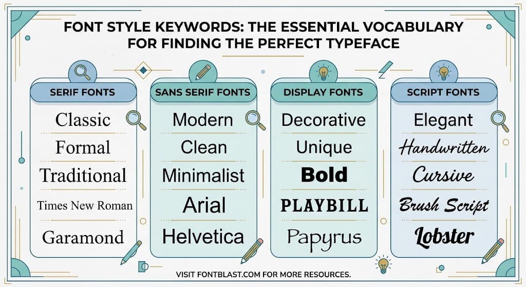
Font style keywords are the descriptive terms that bridge the gap between a vague visual idea and the actual typeface that matches it. Whether you are searching a font marketplace, briefing a designer, or feeding prompts into an AI generator, knowing the right keywords is what turns "I want something that feels modern" into a font you can actually use.
Why Font Style Keywords Matter More Than Ever
Typography in 2026 has become increasingly expressive. The dominant trend is a move away from neutral, invisible fonts toward typefaces that carry personality and act as design statements -5. Terms like "funky curvy serifs," "novel italics," and "quiet sans-serifs" have become standard vocabulary in design briefs and trend reports -9-18.
This shift means users need precise language to describe what they want. A generic search for "serif font" returns over 110,000 monthly searches on Etsy alone, but that broad keyword can't distinguish between a traditional Old Style serif and the "chunky, juicy serifs" currently trending in branding -4-9. Specific keywords do that work.
The Core Font Style Keyword Categories
Font keywords generally fall into a few structural categories that describe the anatomy and classification of typefaces.
Serif vs. sans-serif is the most fundamental distinction. Serifs have small decorative strokes at the ends of letterforms; sans-serifs do not -2. Within these, more specific terms matter: geometric sans (built on circular shapes, like Futura), humanist sans (warmer, more organic, like Gill Sans), and grotesque sans (mechanical and neutral, like Helvetica) -2.
Weight and width keywords describe physical characteristics. Terms like "thin," "light," "regular," "medium," "bold," and "black" indicate stroke thickness. "Condensed," "extended," "narrow," and "wide" describe horizontal proportions. CSS font specifications formalize these as stretch values ranging from "ultra-condensed" to "ultra-expanded" -16.
Style descriptors cover slant and form. "Italic" and "oblique" both indicate slanted letters, though italics traditionally include cursive-style letterforms. "Upright," "roman," and "cursive" are other standard terms in this category -3.
Trending Font Style Keywords in 2026
Trend reports reveal a distinct vocabulary shift this year. Designers are moving away from minimalism toward more expressive, characterful type -9.
Funky curvy serif is arguably the defining keyword of 2026. Envato describes it as "retro energy with modern confidence"—chunky, juicy letterforms with bold curves and subtle imperfections. This style has appeared in major rebrands, including Affinity's recent identity update -9.
Novel italics describes slanted type that breaks the mold. Instead of subtle emphasis, these are "liquid, loopy, and full of personality," sometimes described as "liquified" or "bubbled" -9. The Pentawards Diamond Best of Show winner for Tilt Beauty used a liquified italic typeface, signaling this keyword's commercial relevance -9.
Quiet sans-serif represents the opposite direction: minimalist, Art Deco-inspired fonts designed to recede rather than shout. This keyword pairs well with luxury branding and editorial design where the type should support rather than dominate -9.
Type brutalism and corporate grunge are newer terms circulating in design communities. Fontspring's trend tracking highlights "loud, confrontational type" and "imperfect, human type" as emerging categories -15.
How Search Demand Maps to Font Keywords
Search volume data reveals which keywords users actually employ. On Etsy, "serif font" generates 110,000 monthly searches with a keyword difficulty of just 22/100—a rare combination of high demand and manageable competition -4. More niche descriptive terms like "font with tails" see only 390 monthly searches, but still represent buyers with specific intent -8.
The lesson is that broad category keywords drive volume, while specific style descriptors capture motivated users. A tool or marketplace optimizing for "font style keywords" should target both: the head terms that bring traffic and the descriptive long-tail terms that convert.
Using Font Style Keywords Effectively
The practical application depends on your context. For design briefs, combining a category keyword with a mood descriptor works best: "geometric sans, friendly and approachable" is clearer than either term alone. For AI font generators, descriptive keywords feed directly into the generation prompt—"bold, rounded, retro-futuristic" produces different output than "elegant, high-contrast, editorial"
For marketplace searches, specificity improves results. Instead of "modern font," try "geometric sans with high x-height" or "quiet Art Deco sans." These compound keywords narrow the field and surface typefaces that actually match the visual intent.
The Bottom Line
Font style keywords are not just search terms—they are a shared vocabulary for describing typography with precision. As fonts become more expressive and varied, that vocabulary becomes more valuable. The designers and tools that master it will find the right typefaces faster and communicate their intentions more clearly.