September 13, 2026
Luxury Fonts: Elegant Typefaces for Premium and Stylish Designs
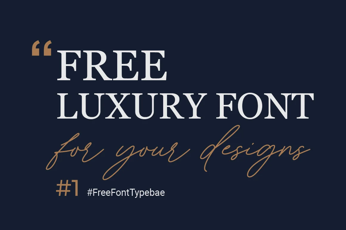
Luxury fonts can give a design an elegant, premium, and sophisticated appearance. They are often used for fashion brands, jewelry businesses, beauty products, wedding invitations, hotels, restaurants, packaging, and high end websites.
The right font can change the entire feeling of a design. A simple word can look modern, expensive, classic, or artistic depending on the typeface, spacing, size, and layout.
Luxury typography often uses refined letter shapes, strong contrast between thick and thin strokes, generous spacing, and clean layouts. However, a luxury font does not always need to be decorative. Simple and minimal fonts can also create a premium appearance when they are used carefully.
What Are Luxury Fonts?
Luxury fonts are typefaces that are commonly used to create an elegant, refined, or premium visual style.
There is no single technical font classification called "luxury." Instead, the term describes the visual feeling created by a font and its use in a design.
Luxury fonts often have:
- Elegant letter shapes
- Refined proportions
- High contrast between thick and thin strokes
- Clean curves
- Stylish serifs
- Generous letter spacing
- A polished appearance
- Strong visual balance
The overall design also matters. Even a beautiful font can look ordinary if it is placed in a crowded layout with poor spacing.
Why Are Luxury Fonts Popular?
Typography is an important part of branding. Before people read the complete message, they see the shape and arrangement of the letters.
A carefully selected typeface can help communicate qualities such as elegance, quality, heritage, confidence, or modernity. Luxury brands often use typography as part of a larger visual identity rather than treating the font as a simple text choice.
Luxury fonts are popular because they can help create a strong first impression.
For example, a thin high contrast serif can make a fashion headline feel editorial. A clean sans serif can make a premium technology brand feel modern. A flowing script can work well for wedding stationery or beauty products.
Characteristics of Luxury Fonts
Although luxury fonts can look very different from one another, many share certain characteristics.
1. High Stroke Contrast
High contrast means there is a noticeable difference between thick and thin parts of a letter.
This is common in Didone style typefaces such as Didot and Bodoni.
The contrast can give large headlines a dramatic and elegant appearance.
2. Elegant Serifs
Many luxury typefaces use sophisticated serif designs.
Serifs are small finishing strokes attached to letters. Classic serif fonts can create a feeling of tradition, authority, and refinement.
They are especially common in fashion, beauty, editorial, and jewelry design.
3. Generous Letter Spacing
Letter spacing can have a major effect on how a luxury font looks.
Designers often use extra space between uppercase letters to create an open and clean appearance.
For example:
LUXURY
can feel very different from:
L U X U R Y
The second version has a more spacious and editorial appearance.
4. Refined Curves
Luxury fonts often have carefully designed curves and terminals.
Small details in letters can make a typeface feel more polished.
5. Minimal Design
Luxury does not always mean adding more decoration.
Many premium brands use simple typography with plenty of empty space. The restraint itself becomes part of the visual style.
Popular Luxury Font Styles
There are several font styles that work well for luxury designs.
Luxury Serif Fonts
Serif fonts are among the most popular choices for premium branding.
They can create a classic and sophisticated appearance.
Some well known examples include:
- Didot
- Bodoni
- Garamond
- Playfair Display
- Libre Bodoni
- Cormorant
High contrast serif fonts are particularly popular for fashion and editorial designs.
Luxury Sans Serif Fonts
Luxury designs do not always require serifs.
Clean sans serif fonts can create a modern and confident appearance. This approach works especially well for contemporary fashion, beauty, technology, architecture, and lifestyle brands.
Popular examples include:
- Futura
- Helvetica
- Montserrat
- Optima
The key is how the font is used. A simple sans serif with careful spacing can look more premium than an overly decorative typeface.
Luxury Script Fonts
Script fonts can create an elegant and personal appearance.
They are often used for:
- Wedding invitations
- Beauty brands
- Boutique businesses
- Personal branding
- Event invitations
- Jewelry packaging
Script fonts should usually be used selectively because highly decorative scripts can become difficult to read.
Luxury Display Fonts
Display fonts are designed to attract attention at larger sizes.
They can work well for:
- Fashion headlines
- Magazine covers
- Product packaging
- Posters
- Social media graphics
- Luxury advertisements
Display fonts are often most effective when there is enough empty space around them.
Best Luxury Fonts for Logos
Choosing a font for a luxury logo requires more thought than choosing a font for a normal headline.
A logo needs to remain recognizable at different sizes.
Classic serif fonts such as Didot and Bodoni are popular references for luxury branding because their proportions and strong stroke contrast can create an elegant visual identity. Other designs use clean sans serif typography for a more modern appearance.
When choosing a luxury logo font, consider:
- Brand personality
- Readability
- Letter spacing
- Font weight
- Scalability
- Uniqueness
- Licensing
Do not choose a font simply because it looks expensive. It should also match the business.
Luxury Fonts for Fashion Brands
Fashion design is one of the most common areas where luxury typography is used.
Fashion brands often need typography that works across:
- Logos
- Clothing labels
- Websites
- Magazine advertisements
- Product packaging
- Social media
- Store signs
High contrast serif fonts can create a traditional fashion editorial style. Clean sans serif fonts can create a modern and minimal identity.
The choice should match the brand's personality.
Luxury Fonts for Beauty and Cosmetics
Beauty brands often use elegant fonts for product names, packaging, websites, and advertisements.
A refined serif can make a cosmetics brand feel classic and sophisticated.
A thin script can give a softer and more personal appearance.
A minimalist sans serif can work well for modern skincare and beauty brands.
The best choice depends on the audience and product positioning.
Luxury Fonts for Wedding Invitations
Luxury fonts are also popular for wedding stationery.
Script and calligraphy fonts can make invitations feel personal and elegant.
However, readability should remain a priority.
One useful approach is to use a decorative script for names and headings while using a simple serif or sans serif font for the main information.
This creates contrast without making the invitation difficult to read.
Luxury Fonts for Jewelry Brands
Jewelry branding often benefits from elegant typography.
A refined serif can work particularly well because it can communicate tradition and craftsmanship.
For a modern jewelry brand, a clean sans serif with generous spacing may be a better choice.
The font should support the product photography rather than compete with it.
Luxury Fonts for Packaging
Packaging is another strong use for luxury fonts.
A product label may use a large elegant typeface for the brand name and a simple font for product details.
This creates a clear hierarchy.
For example:
BRAND NAME
Premium Facial Serum
30 ml
The first line can use the main luxury typeface while the supporting information uses a simpler font.
Luxury Fonts for Websites
Luxury websites often use typography with plenty of white space.
A high contrast serif can work well for large headlines, while a simple sans serif can make menus and body text easier to read.
This combination gives the website a premium appearance without sacrificing usability.
Remember that some very thin font styles can become difficult to read on small screens. Always test your chosen font on phones, tablets, and desktop screens.
How to Choose the Right Luxury Font
Choosing a luxury font should start with the personality of your project.
Ask yourself what you want people to feel when they see the design.
For Classic Luxury
Choose an elegant serif.
This works well for jewelry, fashion, hotels, premium products, and traditional brands.
For Modern Luxury
Try a clean sans serif.
This can work well for technology, architecture, modern fashion, and lifestyle brands.
For Romantic Luxury
Consider a script or elegant handwritten typeface.
This can work well for weddings, beauty, invitations, and boutique businesses.
For Editorial Luxury
Try a high contrast serif with generous spacing.
This style works well for magazines, fashion campaigns, and premium editorial designs.
How to Use Luxury Fonts Correctly
Finding a good font is only the first step.
How you use the font is equally important.
Use Plenty of White Space
Crowded designs can make even an expensive font look cheap.
Leave enough space around headlines, logos, and other important elements.
Do Not Use Too Many Fonts
Using several decorative fonts can make a design confusing.
A better approach is usually to select one main display font and one supporting font.
Use Letter Spacing Carefully
Extra spacing can create an elegant appearance, especially with uppercase headlines.
However, too much spacing can make words difficult to read.
Keep the Layout Simple
Luxury design often benefits from restraint.
Avoid adding unnecessary effects, shadows, outlines, and decorations.
Choose the Right Font Weight
Very thin fonts can look beautiful at large sizes but may disappear at small sizes.
Always test the font at the size where it will actually be used.
Luxury Font Pairing Ideas
Font pairing means using two or more typefaces together.
A common approach is to combine an elegant display serif with a simple sans serif.
For example:
Headline: Cormorant Garamond
Body: Montserrat
Another option is:
Headline: Libre Bodoni
Body: Helvetica
The goal is to create contrast while keeping the overall design consistent.
Free Luxury Fonts
You do not always need to purchase a premium font to create a luxury design.
Several free typefaces can work well for elegant projects.
Some options worth exploring include:
- Cormorant
- Cinzel
- Libre Bodoni
- Playfair Display
- Libre Baskerville
Before using any free font for a commercial project, check its current license. "Free" does not always mean that every type of commercial use is allowed.
Luxury Fonts for Social Media
Luxury fonts can work particularly well in social media graphics.
They can be used for:
- Instagram posts
- Pinterest graphics
- Facebook banners
- Product promotions
- Quote graphics
- Fashion posts
- Beauty advertisements
For social media, make sure the text remains readable on mobile screens.
Large headlines, clean layouts, and strong contrast usually work better than very small decorative text.
Luxury Fonts and Brand Identity
A luxury font should be part of a larger visual system.
A brand may use one typeface for its logo, another for headings, and a simple font for body text.
The colors, photography, spacing, packaging, and typography should work together.
Typography alone cannot create a luxury brand. It supports the overall identity.
Common Mistakes When Using Luxury Fonts
There are several mistakes designers should avoid.
Using Too Many Decorative Fonts
Multiple decorative typefaces can make a design look messy.
Ignoring Readability
A beautiful font is not useful if customers cannot read the message.
Adding Too Many Effects
Drop shadows, gradients, outlines, and other effects can reduce the clean appearance that many luxury designs rely on.
Poor Spacing
Even a high quality typeface can look unprofessional when letters and lines are badly spaced.
Ignoring Licensing
Always check whether the font allows commercial use, logo use, web embedding, or other intended applications.
Are Luxury Fonts Only for Expensive Brands?
No.
Anyone can use luxury typography.
A small business, personal brand, wedding project, restaurant, blogger, or content creator can use an elegant typeface.
The important thing is to match the font to the project.
A luxury font does not automatically make a design look premium. The layout, spacing, colors, images, and overall presentation also matter.
Frequently Asked Questions
What are luxury fonts?
Luxury fonts are typefaces commonly used to create elegant, refined, sophisticated, or premium looking designs.
What is the best luxury font?
There is no single best luxury font. Didot, Bodoni, Cormorant, Libre Bodoni, Playfair Display, and other refined serif fonts are popular choices, while clean sans serif fonts can also create a modern luxury style.
What font is best for a luxury logo?
A refined serif or clean sans serif can work well. The best option depends on the brand personality, audience, and design style.
Are luxury fonts free?
Some luxury style fonts are free, while others require a commercial license. Always check the font's licensing terms before using it commercially.
Can I use luxury fonts on Instagram?
Yes. Luxury fonts can be used in Instagram graphics, logos, advertisements, and other visual content as long as the font license permits your intended use.
Are serif fonts better for luxury designs?
Serif fonts are strongly associated with many traditional luxury designs, but they are not the only option. Modern luxury brands can also use clean sans serif typography.
Final Thoughts
Luxury fonts can add elegance and personality to many types of designs. They are especially useful for fashion, jewelry, beauty, weddings, hotels, packaging, logos, and premium branding.
Classic serif fonts such as Didot and Bodoni are popular choices for a traditional luxury appearance. Modern sans serif fonts can create a cleaner and more contemporary style. Script fonts can add a personal and romantic touch.
The most important thing is not simply choosing a font labeled "luxury." Focus on letter shape, spacing, readability, and the overall design. A simple font used with good spacing and a clean layout can create a stronger premium impression than an overly decorative typeface.
With the right combination of font, layout, and visual style, typography can make your design feel polished, elegant, and memorable.