September 29, 2026
Font Trends: What's Actually Shaping Typography This Year
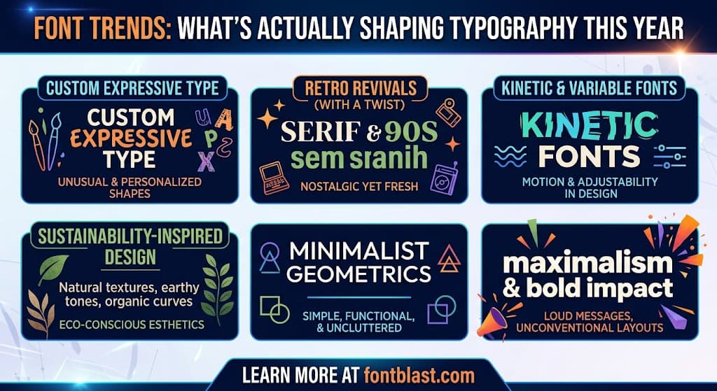
Font trends mark a decisive break from the minimalist, neutral typography that dominated the past decade. This year, designers are treating letterforms as expressive design statements—twisting, stretching, and distorting type to carry personality, emotion, and cultural meaning-2. The shift reflects broader changes in how brands communicate: instead of hiding behind safe, invisible fonts, they're using typography as a primary vehicle for identity.
The Defining Trend: Expressive, Personality-First Typography
The clearest signal from 2026 trend reports is that fonts are no longer just vehicles for words—they're design statements in their own right-2. Envato's trend analysis describes the year's dominant mood as type that "talks back, flirts with chaos, and makes you feel something"-2. This manifests across multiple specific styles:
Funky curvy serifs stand out as arguably the year's signature trend. Described as "retro energy with modern confidence," these chunky, juicy letterforms bring psychedelic warmth to branding and web typography-2. The style has appeared in major rebrands, including Affinity's recent identity update following its acquisition by Canva, and Eventbrite's shift from minimalist sans-serif to a bouncy serif logo-2. This trend signals that brands are rejecting corporate sterility in favor of approachable, characterful typography-8.
Novel italics represent another major shift. Long relegated to emphasis, italics are now "the stars—liquid, loopy, and full of personality"-2. The Pentawards Diamond Best of Show winner, Tilt Beauty, featured a bold, liquified italic typeface, demonstrating the style's commercial viability-2. This trend appeals particularly to brands targeting younger audiences or seeking to disrupt industry conventions-2.
Quiet sans-serifs offer a counterpoint to the maximalist direction. Inspired by Art Deco but stripped of its glitz, these fonts "whisper rather than shout," making them ideal for luxury branding and editorial design where type should support rather than dominate-2. Pentagram's identity for textile business SCENARIO exemplifies this subtle approach-2.
The Broader Landscape: Beyond Individual Styles
Several structural trends define 2026 typography beyond specific aesthetics:
Variable fonts are finally becoming standard practice. Though the technology launched in 2016, adoption lagged for years. Now native to every major browser and design tool, variable fonts enable responsive typography—weight that shifts with scroll depth, width that compresses as viewports narrow, and optical sizing that adjusts based on rendering size-6. As one analysis puts it, "A variable font isn't a file. It's a design space—a continuum of possibilities collapsed into a single, living object"-6.
Kinetic typography is maturing. Motion applied to type has existed for decades, but 2026's kinetic typography is different in kind—"typography functioning as choreography"-6. The best examples use motion with intentionality, directing attention and marking rhythm rather than decorating for its own sake-6. This trend is being taken seriously by editorial designers, brand teams, and motion directors alike-6.
The handmade letter is returning—not as nostalgia, but as resistance. As AI-generated aesthetics become ubiquitous, designers are drawn to typography with visible human touch: uneven edges, brushy strokes, and textures that feel authentically crafted-6. This isn't the artisanal cliché of the late 2010s; it draws from formal mid-century commercial scripts, vernacular brush lettering, and non-Latin calligraphic traditions that digital typography historically bypassed-6.
What's Actually Popular in Practice
Trend reports describe direction, but data reveals what designers and businesses actually use. Shopify's analysis of over 2 million stores found that geometric sans-serifs dominate ecommerce, used by 37.8% of stores, followed by humanist sans (34.3%) and grotesque sans (19.3%)-7. Free fonts power the majority—70.5% of Shopify stores use a free font as their primary storefront typeface, with Google Fonts' Assistant and Poppins among the most popular choices-7.
On the broader web, Apercu emerged as 2026's most popular font according to Typewolf's aggregation of data from over 3,000 websites and foundries-4. Designed by UK-based Colophon foundry in 2010, Apercu's low-contrast, casual-but-refined character works well in minimalist compositions—making it a fitting match for the 2020s aesthetic-4. The font's adoption by institutions like MoMA and Zeit Magazine signaled its ascent-4.
How to Apply These Trends Without Dating Your Brand
Trends offer inspiration, but chasing them blindly risks visual obsolescence. The most effective approach treats trends as a layer on top of a stable typographic system.
Start with function, then add character. Choose your baseline font for readability and versatility first, then select an accent typeface that carries the trend-forward personality-16. The "one baseline + one accent" formula remains the most reliable approach for brands that want to look confident without becoming chaotic-16.
Test before committing. Run a real screen test with your chosen fonts at actual sizes: H1 at 48px, body at 16px, captions at 14px. Check readability on mobile, spacing rhythm, number rendering, and punctuation-16. A font that looks striking in a specimen may fail in real layouts.
Remember that trends cycle. Art Nouveau gave way to Art Deco historically, and similar cycles repeat-11. A funky curvy serif that feels fresh in 2026 may feel dated by 2029. Brands with long-term vision should consider whether their typography system can evolve without complete reinvention.
The Bottom Line
2026 typography is defined by expressive, intentional type choices. The minimalist default is giving way to fonts that carry personality, warmth, and cultural reference. Funky curvy serifs, novel italics, and quiet Art Deco-inspired sans-serifs represent different expressions of this shift. But the most important trend isn't a specific style—it's the discipline of choosing type deliberately rather than by default, testing it rigorously, and building systems flexible enough to evolve.