September 5, 2026
Best Fonts for Logos: How to Choose the Right Font for Your Brand
A logo is often the first thing people notice about a business. A good logo can make a brand easier to remember, while the wrong font can make even a great design look unprofessional.
Typography plays a major role in logo design. The right font can communicate whether a brand is modern, friendly, elegant, creative, serious, or bold. That is why choosing one of the best fonts for logos is an important part of creating a strong visual identity.
There is no single font that works for every business. A technology company may need a clean and modern typeface, while a luxury brand may benefit from an elegant serif font. A children's brand could use something playful and colorful.
In this guide, we will look at popular font styles for logos, explain what makes them useful, and show you how to choose the right font for your brand.
What Makes a Good Logo Font?
A logo font needs to do more than look attractive. It should remain clear when the logo is displayed at different sizes and on different platforms.
A good logo font is usually:
- Easy to read
- Easy to remember
- Suitable for the brand
- Clear at small sizes
- Distinctive without being confusing
- Available with an appropriate license
- Suitable for both digital and print use
Your logo may appear on a website, business card, social media profile, product package, sign, or advertisement. The font should work well in all of these places.
Best Font Styles for Logos
Before selecting a specific typeface, it helps to understand the main font categories.
1. Sans Serif Fonts
Sans serif fonts have clean letter shapes without decorative strokes at the ends of letters.
They are popular for modern logos because they are simple, clean, and easy to read.
Sans serif fonts work especially well for:
- Technology companies
- Startups
- Online businesses
- Marketing agencies
- Modern brands
- Sports companies
Popular examples include Montserrat, Poppins, Helvetica, Futura, and Proxima Nova.
2. Serif Fonts
Serif fonts have small decorative strokes at the ends of letters. They often give a logo a traditional, established, or sophisticated appearance.
Serif fonts are often suitable for:
- Fashion brands
- Luxury businesses
- Law firms
- Publishing companies
- Hotels
- Financial companies
Examples include Playfair Display, Garamond, Baskerville, and Georgia.
3. Script Fonts
Script fonts are designed to resemble handwriting or calligraphy. They can add personality and elegance to a logo.
They are often used by:
- Wedding businesses
- Beauty brands
- Restaurants
- Photography businesses
- Fashion brands
- Handmade product companies
Script fonts should be used carefully because some decorative styles can become difficult to read.
4. Display Fonts
Display fonts are designed to attract attention. They often have unusual shapes, strong details, or distinctive styles.
They can work well for:
- Entertainment brands
- Gaming companies
- Creative businesses
- Clothing brands
- Events
- Food and beverage companies
The key is to choose a display font that matches your brand rather than selecting one simply because it looks unusual.
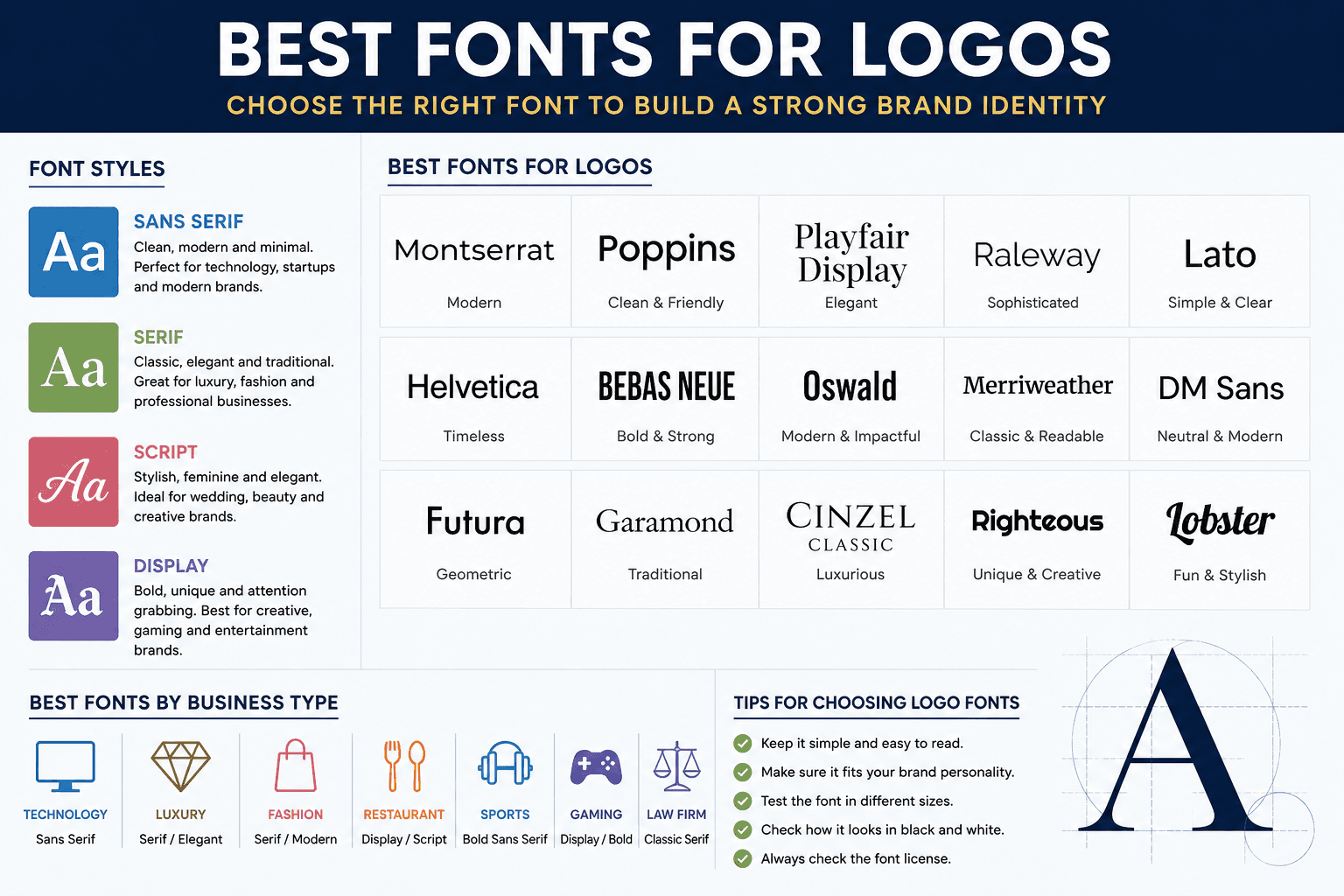
15 Best Fonts for Logos
Here are some popular fonts that can work well for different types of logo designs.
1. Montserrat
Montserrat is one of the most versatile choices for modern logo design. Its clean geometric shapes make it easy to read and suitable for many industries.
It works particularly well for:
- Startups
- Technology brands
- Marketing companies
- Online stores
- Personal brands
Its different weights also make it flexible for creating strong wordmarks.
2. Poppins
Poppins has a clean geometric appearance and is especially popular in modern digital design.
Its rounded forms can make a brand feel friendly while still looking professional.
Poppins can work well for:
- Apps
- Technology companies
- Education brands
- Digital agencies
- Online services
3. Helvetica
Helvetica is famous for its clean and neutral appearance. It has been used extensively in branding and graphic design.
Its simple appearance makes it suitable for companies that want a professional and timeless identity.
Helvetica can be a good option for:
- Corporate brands
- Technology companies
- Retail businesses
- Professional services
4. Futura
Futura is known for its geometric design and clean appearance. It can give a logo a modern and confident look.
It is particularly useful when a business wants typography that feels bold without becoming overly decorative.
5. Playfair Display
Playfair Display is an elegant serif font that can work well for sophisticated branding.
It is a strong choice for:
- Fashion
- Beauty
- Luxury products
- Weddings
- Lifestyle brands
Its contrast between thick and thin strokes gives logos a refined appearance.
6. Garamond
Garamond is a classic serif style with a long history in typography. It can make a logo feel traditional, professional, and established.
It can work particularly well for:
- Publishing
- Books
- Professional services
- Luxury products
- Heritage brands
7. Bebas Neue
Bebas Neue has tall, bold letters that can make a strong visual statement.
It works well for logos that need a powerful and direct appearance.
Consider it for:
- Sports brands
- Fitness companies
- Clothing brands
- Entertainment
- Gaming
8. Raleway
Raleway is a clean typeface that can create an elegant and modern logo.
Its lighter styles can work well for sophisticated brands, while heavier weights can provide more visual impact.
9. Oswald
Oswald has a condensed design that makes it useful when you need a strong logo without taking up too much horizontal space.
It can work well for:
- Sports brands
- News websites
- Restaurants
- Clothing companies
- Media brands
10. Lobster
Lobster is a decorative script style that can give a logo a casual and creative personality.
It may work well for food businesses, cafes, lifestyle brands, and other companies that want a friendly visual style.
Because it is highly distinctive, it should be used carefully and paired with clear supporting text when necessary.
11. Merriweather
Merriweather is a readable serif typeface that can provide a warm and professional appearance.
It can be useful for brands that want a traditional feel without looking outdated.
12. Cinzel
Cinzel has a classical appearance inspired by historical Roman lettering.
It can work well for brands that want an elegant, dramatic, or premium visual identity.
13. Lato
Lato is a clean and approachable typeface. It can make a logo feel professional while maintaining a friendly appearance.
It is suitable for:
- Businesses
- Software companies
- Consulting firms
- Education brands
- Online services
14. Righteous
Righteous has a distinctive geometric appearance. It can be useful for creative branding where the logo needs more personality.
It may work well for entertainment, technology, gaming, and creative projects.
15. DM Sans
DM Sans is a modern sans serif typeface that works well in digital environments.
Its clean appearance makes it suitable for websites, apps, online businesses, and modern startups.
Best Logo Fonts by Business Type
The best font depends heavily on what your business does.
Business TypeFont Styles to Consider
Technology
Sans serif
Luxury
Serif or elegant script
Fashion
Serif or modern sans serif
Restaurant
Display, serif, or script
Sports
Bold sans serif or condensed
Gaming
Display or bold fonts
Photography
Elegant serif or script
Law Firm
Traditional serif
Children's Brand
Rounded or playful fonts
Finance
Clean serif or sans serif
Beauty
Elegant serif or script
Real Estate
Professional serif or sans serif
How to Choose the Right Logo Font
Start by thinking about your brand personality.
Ask yourself:
Is the brand modern?
Choose a clean sans serif typeface.
Is the brand traditional?
Consider a classic serif.
Is the brand luxurious?
Look at elegant serif or refined script fonts.
Is the brand playful?
Consider rounded or display fonts.
Is the brand powerful?
Try bold or condensed typography.
This simple approach can narrow down hundreds of options.
Think About Readability
A logo should be recognizable quickly.
Avoid fonts with extremely complicated letter shapes if people need to read the company name immediately.
A decorative font may look beautiful in a large design but become difficult to read when the logo is reduced to a small social media icon.
Always test your logo at several sizes before making a final decision.
Try Different Font Weights
Many fonts are available in multiple weights, such as:
- Thin
- Light
- Regular
- Medium
- Semi Bold
- Bold
- Extra Bold
- Black
Changing the weight can completely change the personality of a logo.
For example, a regular font can feel calm and professional, while a bold version can feel stronger and more energetic.
Consider Font Pairing
Some logos use two fonts instead of one.
For example, you might use a bold sans serif for the company name and a simple serif for a tagline.
However, using multiple fonts can make a logo look cluttered if the styles do not work together.
For most simple wordmark logos, one strong font is often enough.
Test Your Logo in Black and White
Color can make almost any font look interesting. That can sometimes hide problems with the typography.
Try your logo in black and white.
If the design still looks clear and professional, the typography is probably working well.
This is especially important because your logo may eventually appear on documents, invoices, stamps, packaging, and other materials where color is not available.
Check the Font License
Before using a font commercially, check its license.
Some fonts are free for personal projects but require a commercial license for business use. Others allow commercial use under specific conditions.
Do not assume that a font being available for free means you can use it for every purpose.
Always check the license provided by the font creator or official font distributor.
Should You Use a Free Font for a Logo?
Yes. A free font can be an excellent choice for a logo.
The important thing is not whether a font costs money. What matters is whether it fits the brand, remains readable, and has a license that permits your intended use.
Many high quality open source fonts are available for designers and businesses.
Where Can You Find Fonts for Logos?
You can explore fonts through reputable font libraries and type foundries. When choosing a font, look at its complete character set, available weights, language support, and license.
A font preview tool can also save time because it lets you test your actual brand name before making a final decision.
For example, type your business name into a font previewer and compare several styles side by side.
Common Mistakes When Choosing a Logo Font
Choosing a font only because it looks cool
A font can look impressive on its own but fail to represent the business.
Always consider the brand first.
Using too many fonts
Two fonts can work together, but adding several different typefaces can make a logo confusing.
Ignoring small sizes
Your logo should remain recognizable on websites, social profiles, mobile screens, and printed materials.
Choosing poor readability
If customers cannot easily read the company name, the font is probably not suitable.
Ignoring licensing
Always check whether your chosen font permits commercial logo use.
Final Thoughts
Choosing one of the best fonts for logos is about more than finding an attractive typeface. The font should communicate the personality of your business, remain readable at different sizes, and work well across digital and printed materials.
Sans serif fonts are excellent for clean and modern brands. Serif fonts can create a traditional or premium appearance. Script fonts can add personality, while display fonts can make a logo more distinctive.
The best approach is to test several fonts with your actual brand name. Compare different weights and sizes, check the design in black and white, and confirm the font license before using it commercially.
A great logo does not always need a complicated font. In many cases, a simple typeface combined with thoughtful spacing, sizing, and design can create a memorable brand identity.