September 5, 2026
Best Fonts for Logos: The Ultimate Guide to Iconic Typography
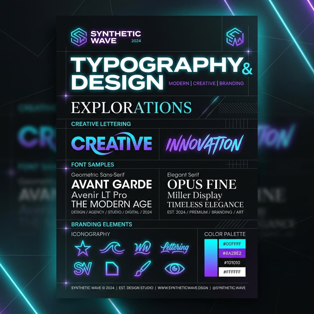
Why Typography Represents 80% of Logo Design
When you think of the world’s most iconic brands—Nike, Google, Vogue, Sony, or FedEx—their logos rely heavily or entirely on typography. A wordmark or logotype communicates your visual identity, personality, values, and industry standing before a user reads a single sentence on your homepage.
Choosing the right logo font is not merely an aesthetic choice; it is a psychological signal. The geometry of your lettering, the thickness of your stems, the presence or absence of serifs, and the kerning between characters tell an immediate story. In this definitive guide, we explore the top logo fonts across key design categories, unpack the psychological impact of type classification, and reveal expert pairing rules to create a timeless logo lockup.
The Anatomy of an Iconic Logo Font
Before selecting a font file, you must understand what makes a typeface suitable for logo design versus body text. Not all beautiful fonts work as logotypes. A great logo typeface must fulfill four critical anatomical requirements:
- Scalability & Legibility: A logo font must remain crystal clear when printed on a 16x16 pixel favicon, embossed on a business card, or displayed on a 50-foot digital billboard. Extreme thin hairlines often disappear at small sizes.
- Distinctive Character Details: Memorable logos feature subtle typographical quirks—such as an angled terminal on an 'e', a custom ligated 'st', or an oversized counter in an 'O'.
- Vector Balance & Geometry: Clean bezier curves and balanced optical weight ensure that your logo renders flawlessly in digital vectors, laser cutting, and embroidery.
- Timelessness: Trends come and go rapidly. A great logo font balances modern relevance with enduring structural integrity, preventing your brand from feeling outdated within three years.
Top Fonts for Logo Design by Category
1. Modern & Geometric Sans-Serifs
Sans-serif fonts convey clarity, innovation, simplicity, and modern tech authority. They are favored by tech giants, startups, modern lifestyle brands, and minimalism enthusiasts.
- Montserrat: Inspired by classic urban signage in Buenos Aires, Montserrat boasts geometric proportions and broad horizontal presence. It gives logotypes a solid, confident, and approachable aesthetic.
- Helvetica / Helvetica Now: The undisputed king of Swiss typography. Clean, neutral, and endlessly versatile, Helvetica has powered logos like Panasonic, Jeep, Target, and Lufthansa.
- Futura: Built entirely on geometric primitives—circles, triangles, and squares. Futura offers an enduring futuristic elegance utilized by Supreme, Nike, and Red Bull.
- Syne: A modern display sans-serif that expands wildly in heavier weights. Syne is exceptionally popular for avant-garde fashion brands, creative agencies, and web3 projects.
2. Heritage & Luxury Serifs
Serif fonts feature decorative strokes at the ends of letter stems. They project heritage, authority, trust, intellect, and timeless luxury.
- Playfair Display: Influenced by 18th-century Enlightenment printing presses, Playfair Display pairs high contrast strokes with graceful curves, making it ideal for premium editorial, skincare, and high-end consumer brands.
- Garamond: A classic Old Style serif with warm humanistic proportions. It communicates historical depth, academic rigor, and refined elegance (used famously by Apple in its early years and Rolex).
- Bodoni: A Didone typeface famous for dramatic contrast between thick stems and paper-thin horizontal serifs. Bodoni is the quintessential luxury fashion font, famously adopted by Vogue and Calvin Klein.
- Cinzel: Grounded in classical Roman inscriptions, Cinzel conveys majesty, history, and premium craftsmanship. It shines in luxury real estate, jewelry, and gaming logos.
3. Bold & Futuristic Display Fonts
Display typefaces are crafted specifically for high-impact titles and standalone logotypes. They possess strong personality and unique geometric attributes.
- Orbitron: A geometric sci-fi font with angled cuts and robotic symmetry. Orbitron is a favorite for gaming studios, esports organizations, and AI technology platforms.
- Space Grotesk: A proportional sans-serif derived from Space Mono. It retains quirky display characteristics while maintaining excellent structural stability for tech logotypes.
- Monument Extended: Featuring an ultra-wide stance and heavy horizontal footprint, Monument Extended commands immediate visual dominance in streetwear and modern agency branding.
The Psychology of Typography in Branding
Every typeface classification triggers subconscious emotional responses in your audience. Understanding these psychological triggers helps align your logo with your target market's expectations:
| Font Family | Psychological Triggers | Best Suited Industries |
|---|---|---|
| Geometric Sans | Modernity, Precision, Honesty, Efficiency | Tech, SaaS, Mobile Apps, Modern Retail |
| Classic Serif | Trust, Heritage, Prestige, Stability | Finance, Law, Luxury Goods, Publishing |
| Extended Display | Power, Confidence, Avant-Garde, Boldness | Streetwear, Architecture, Creative Studios |
| Humanist Sans | Warmth, Accessibility, Innovation, Friendliness | Healthcare, Education, Wellness, Food |
How to Pair Fonts in a Logo Lockup
If your logo features both a brand name (primary logotype) and a tagline (secondary descriptor), font pairing is essential. Follow these rules for a balanced composition:
- Establish Clear Hierarchy: Your primary brand name should dominate visually. Use weight, size, and letter-spacing (tracking) contrast to make the primary name pop.
- Combine Opposite Classifications: Pair a bold display font or serif logotype with a clean, neutral geometric sans-serif for the tagline (e.g., Playfair Display logotype + Montserrat tagline in uppercase with wide tracking).
- Keep Weight & Width Balanced: Avoid pairing two heavy display fonts together. If the primary logotype is ultra-heavy, make the tagline light or medium.
- Restrict to Maximum 2 Fonts: Using three or more fonts in a single logo lockup creates visual chaos and undermines brand recognition.
5 Critical Mistakes to Avoid in Logo Typography
Even seasoned designers can fall into common typographic traps when crafting a logo. Keep these pitfalls in mind:
- Using Gimmicky or Overused Free Fonts: Fonts like Comic Sans, Papyrus, or overly ubiquitous default fonts can instantly cheapen your brand's image.
- Ignoring Custom Kerning: Default font kerning is designed for running paragraphs, not standalone logos. Always manually adjust spacing between tricky letter pairs like 'AV', 'Wa', or 'T.'.
- Over-customizing Every Letter: Trying to add unique visual twists to every character results in a noisy design. Focus on one or two distinct letterform modifications.
- Neglecting Dark and Light Modes: Test your logo font on black, white, and colored backgrounds. Ensure stroke weight doesn't look visually blown out on dark backdrops.
Conclusion
Your logo typeface is the foundational pillar of your brand's visual identity. Whether you opt for the crisp precision of Montserrat, the refined luxury of Playfair Display, or the bold futuristic presence of Space Grotesk, ensure your typography aligns with your core message and scales seamlessly across all digital and print mediums. Explore FontDrop's collection of font generators and text previewers to experiment with custom logo lockups today!